Skip to content

BRANDING

PACKAGING

GRAPHIC DESIGN

COMMUNICATION

STATIONARY

EDITORIAL

client: AZAL – Azeites do Alentejo

OBJECTIVE

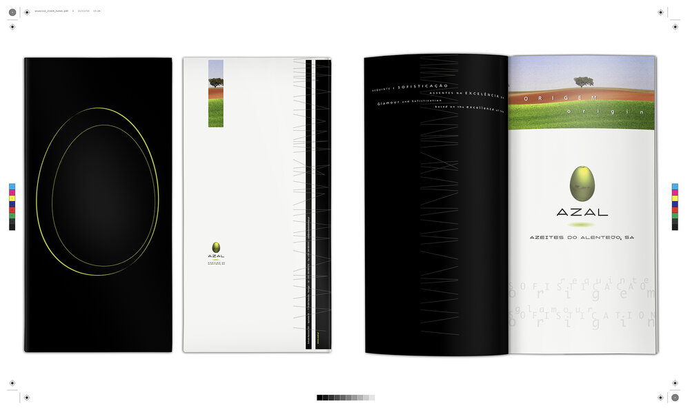
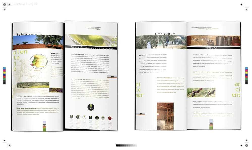
In the name of building a symbolic identity, rooted in a set of values ​​and a personality, brands choose a space of origin, their own territory – geographic and symbolic.


MOTTO

Creating a brand is working on an identity and a membership root.

credits: QUARTO CRESCENTE – Design e Publicidade | HELENA DO ROSÁRIO (copy wright)

# STORYTELLER

Refinement and sophistication

based on the excellence of the origin

WATCH THE VÍDEO

STATIONERY

INSTITUTIONAL BROCHURE

… by a thread

By a thread of the purest and most flavorful of olive oil AZAL will take to the plains of Alentejo the best olives.

PACKAGING

ANÚNCIO

Message successfully sent!

Thanks.

Mensagem enviada com sucesso!

Obrigada.