COMMUNICATION
GRAPHIC DESIGN
PACKAGING
client: Bride and Groom
Every bride and groom are unique and different.
MOTE
Develop graphic pieces that reflect a personalised concept, fully meeting the needs and desires of the protagonists.
The process begins with the drafting of the wedding invitation, which serves as the launch pad for other pieces, such as the table plan, place markers, menus and gifts.
CHALLENGE
To ensure that all the needs and expectations imagined by the couple are met on this special day, maintaining a cohesive graphic line in all the pieces, in order to convey the chosen concept in a consistent manner
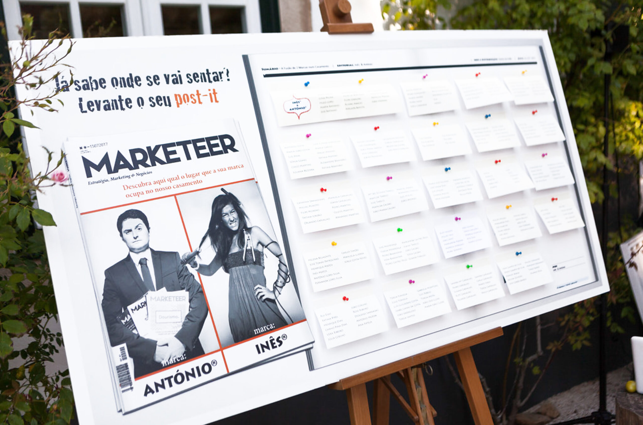
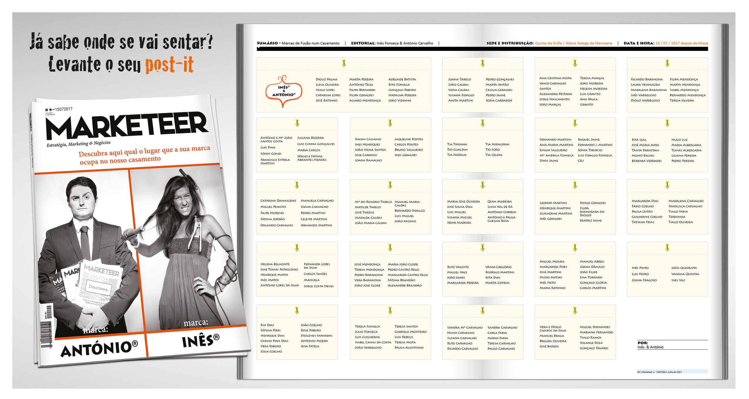
“MARKETEER” Bride and Groom
After several meetings with the bride and groom…the idea emerged! Capitalising on a photo shoot the bride and groom had done. Both graduated in Marketing. From that point on, I created a story:
The opposites attract VS The one thing that brings them together is much stronger.
I simulated the cover of a magazine, Marketter. On the cover, the launch of 2 brands, 2 personalities, 1 wedding. This would be the MOTE of the event. From that point on, all the pieces were designed and worked around this concept.
The invitation became a leaflet.
The table markers, all different postcards, with different brands, accompanied by quotes that matched the respective brand.
The table panels were designed so that ALL the guests could interact with the piece. They had to pick up a post it, which revealed the name of each guest.


TABLE PANELS

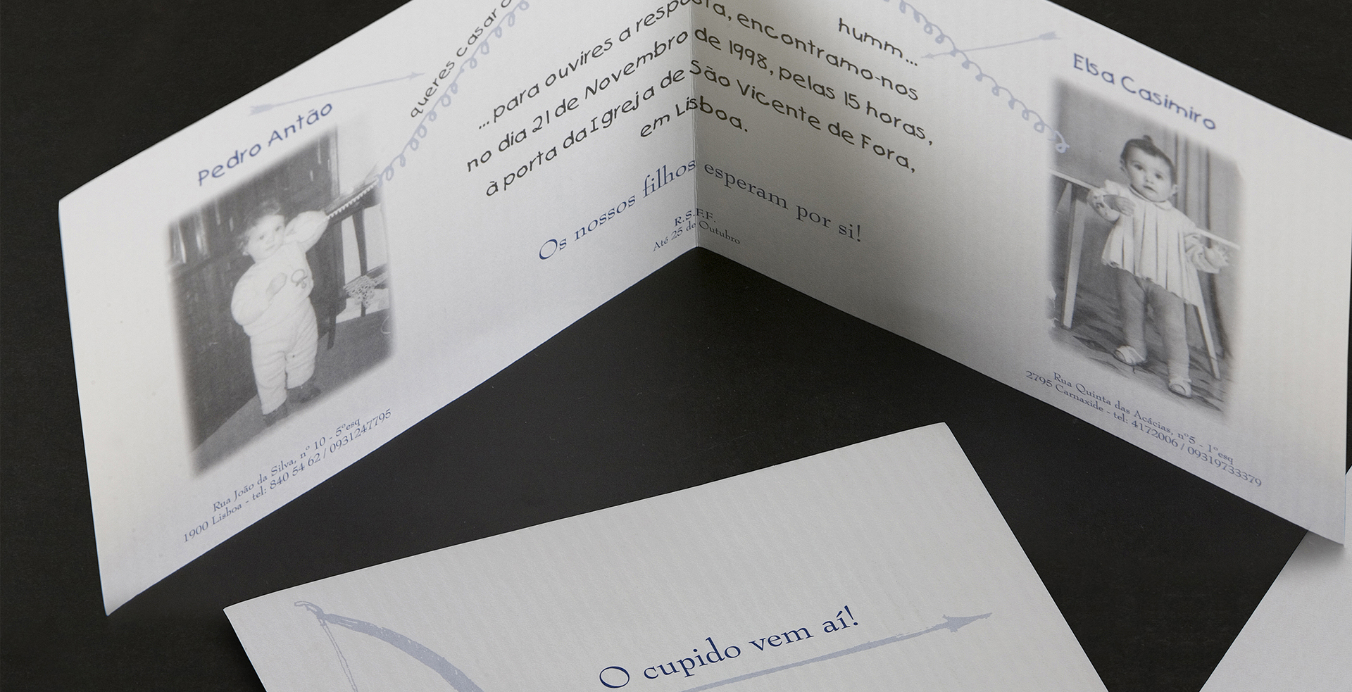
“CUPID is coming!” Bride and Groom
I had full freedom. After all, it was my brother who was getting married!
The bride and groom wanted THEIR invitation.
The invitation referred to a dialogue “between the two of them”, over the phone the bride and groom, in their underwear, would meet at the church door. He asks: will you marry me? She replies:…..hummm… But it happened.
The theme…. Cupid is coming! The rest was precise. A Cupid’s bow that hit the spot.
The invitation became a leaflet.
The table markers, postcards with cupid arrows.
The table panels were designed so that ALL the guests would be the targets of the party.

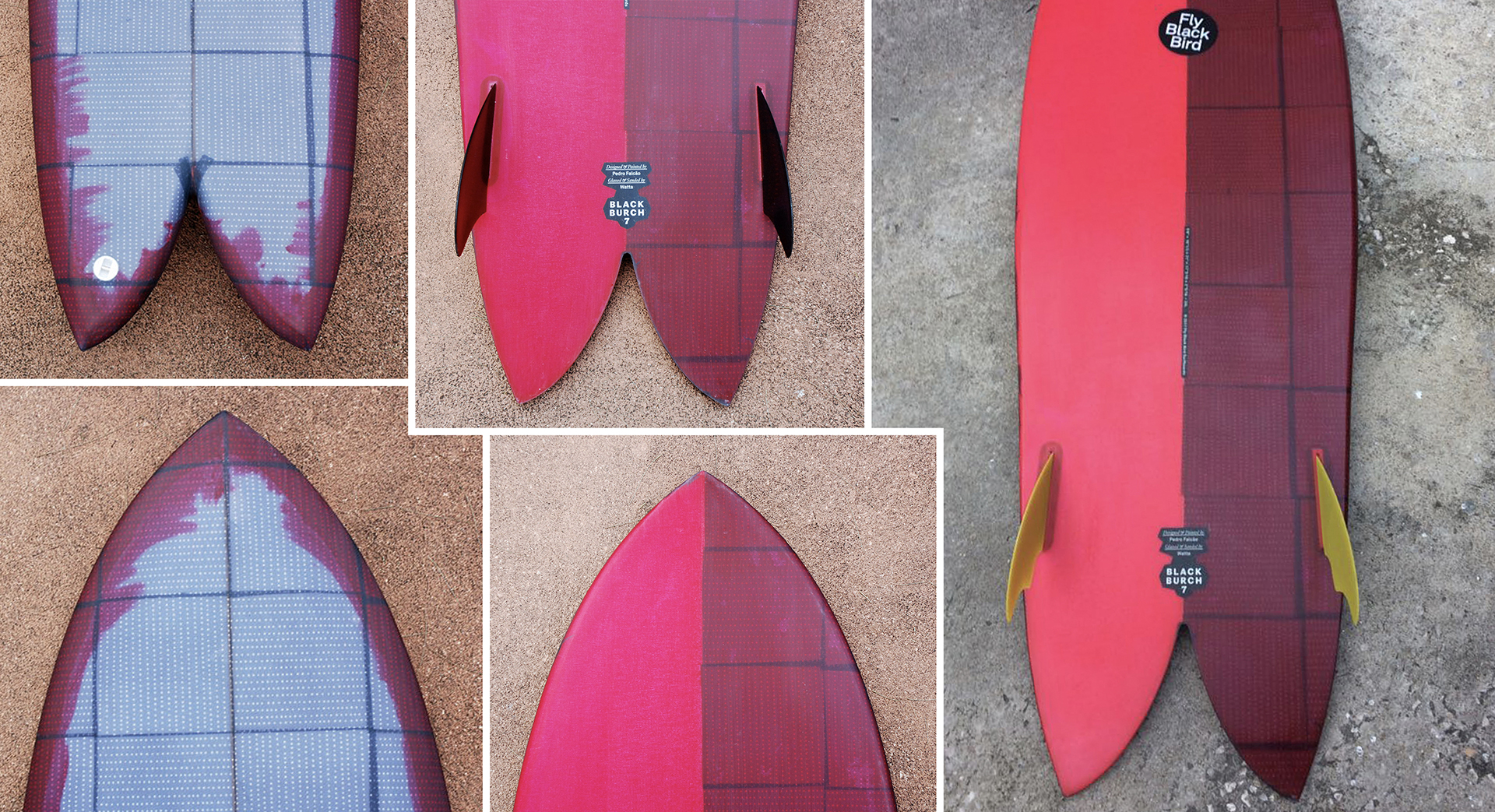
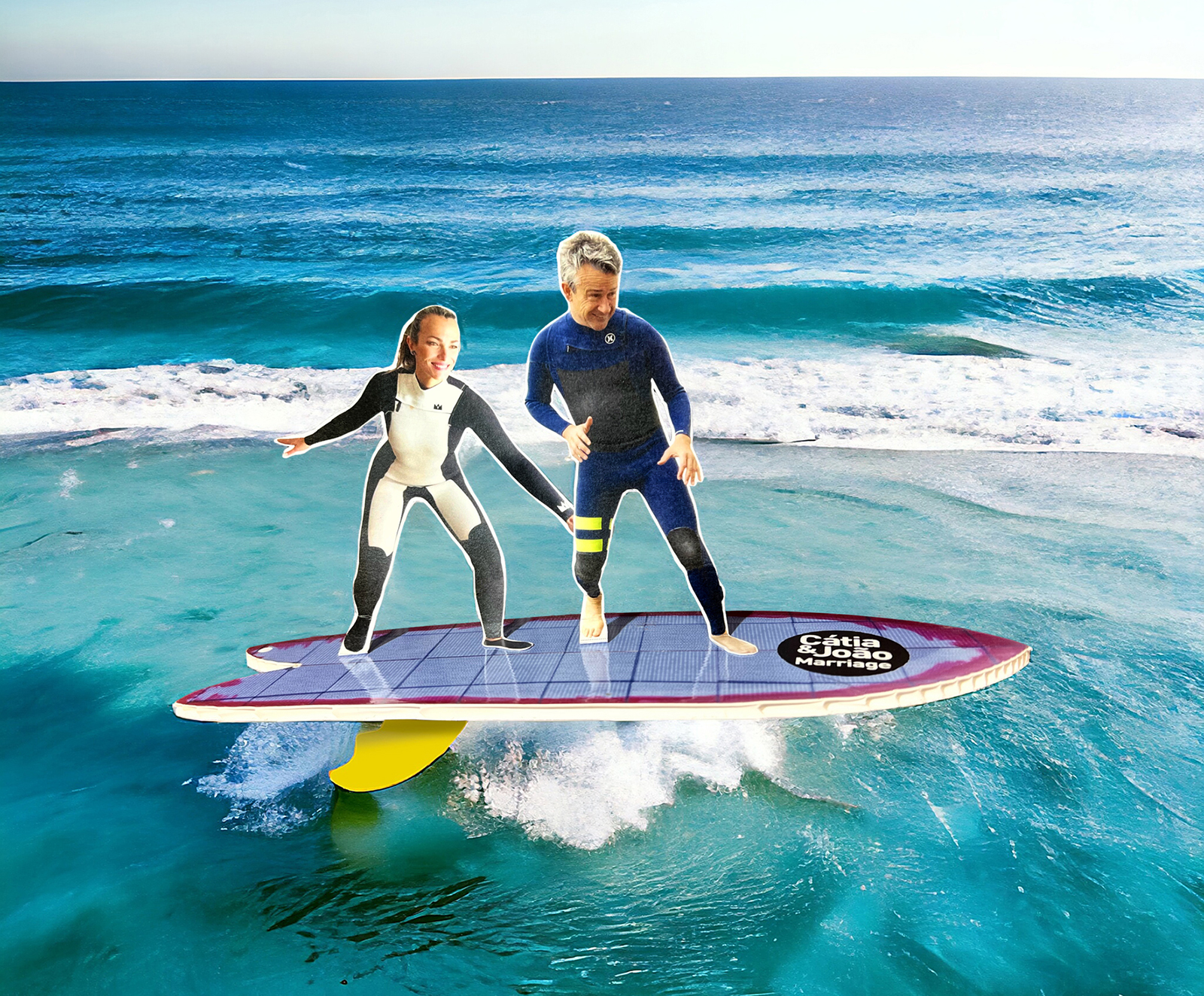
“SURFING” Bride and Groom
The bride and groom both LOVE surfing. That’s why….They got married in surf suits! We decided in unison to take the theme seriously.
I literally redesigned a surfboard with fins and everything. Just like the bride’s board. The same colours. The same stickers, adapted to both their names.
On the underside of the board (a bleached board printed on vinyl) was a small text referring to the day, time and name of the bar where the ceremony was to take place and, of course, the DRESS CODE: beachwear!
At the top were the bride and groom, cut out in cardboard, glued by their feet to the board and dressed in their surf suits in a “Let’s go surf the wave” position!
They were hand-delivered personally to each of the guests. This was the only way to appreciate the faces of the guests as they looked at the surfboard and enjoyed hearing the laughter of all those who were presented with “the piece”!

“1 FreeDrink” Bride and Groom
The bride, a lawyer. The groom, a PR man… They met at the Night and it all started with a PASSWORD! A password that was worth a drink. 7 years later, after many passwords, they decided to get married!
This would be the MOTE on the invitation. As they both liked 80s music, all the graphic language would allude to that aesthetic. A logo was created with their initials and, of course, a ball of lights reminiscent of the discos of that era.
The invitation: A shiny black bag closed by a transparent label and a ZIP. Inside was a card, F/V with a photo of the bride and groom and a small “password”. The texts followed the motto and the communication was always in the form of a teaser, revealing the information needed for the event – date, place, time.
The table panels were transformed into a giant Spotify playlist. All the songs were chosen by the bride and groom. Each table was given a card which in turn corresponded to 1 album cover. On the back of the card were the names of the guests.
The table identifiers, in the shape of a tripod, illustrated the covers of the chosen albums. On the back was the menu chosen for the dinner.


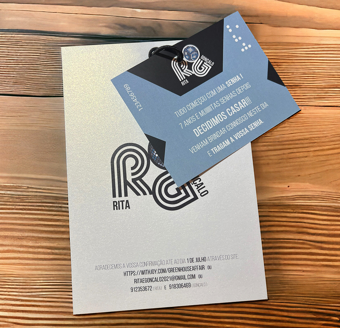

TABLE PANELS